Brand strategy · Identity · Perfumery
Rapp & Esen
A bespoke perfume house that composes one formula for one person. The work made an invisible, one-of-one idea legible.

The context
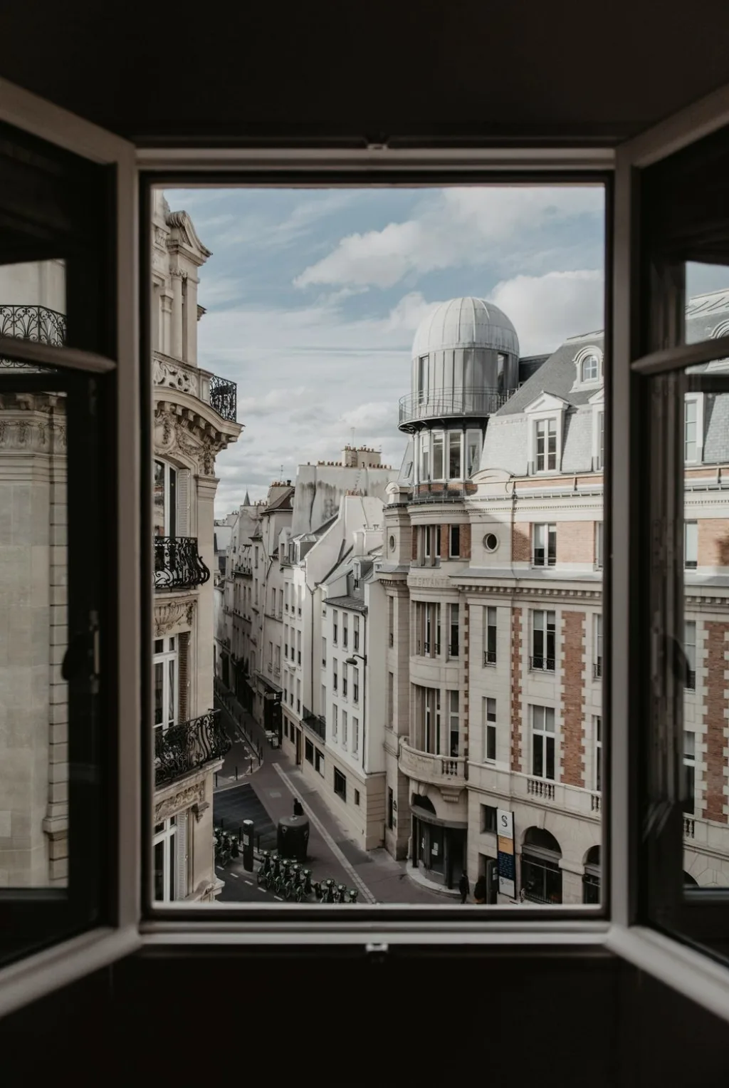
Rapp & Esen is a bespoke perfume house in France. Françoise Rapp, the nose of the house, composes one formula for one person, composed once and refilled for life.
The founders were not adding another fragrance to a shelf. They were building a house around a single idea: that a scent can hold the truth of a person rather than cover it.
The challenge was the hard kind. A perfume is invisible. A made-to-measure, one-of-one proposition has no range, no familiar category and no shelf to be recognised on. The brand had to make something invisible and singular feel legible, desirable and trustworthy, without borrowing the codes of mass luxury perfumery.
The discovery
The work began below the surface. Before any typography or colour, I explored the deepest values and intentions of the house, and brought the two founders into alignment on what they were really making.
What emerged was a philosophy rather than a style: you already are someone. Where others sell a mask, this house reveals. One formula. One person. One intention.
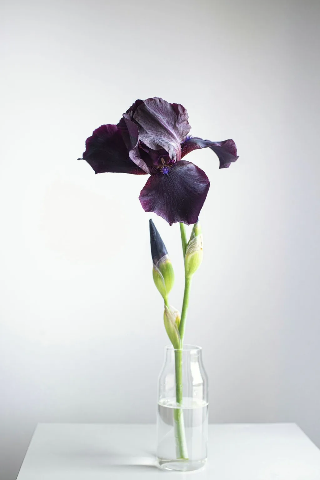
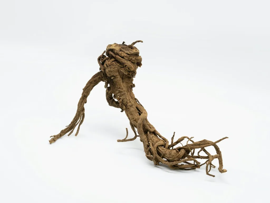
The emblem followed from the material itself. Not the iris flower, but the root of Iris pallida, the part that holds the scent underground, over years. The house would be built on what lasts, not on what is displayed.
The strategy
The positioning collapsed to one sentence it could defend: the house composes the truth of a scent, for one person, so that who they are can be recognised. Wish for what you have.
From that centre, the rest could be decided. The product is not a bottle but a relationship: composed once, followed through every stage from the client’s own account, and refilled for life. Three doors all lead to the same person: a bespoke creation, a scent for an occasion, and a scent as an asset for a brand.
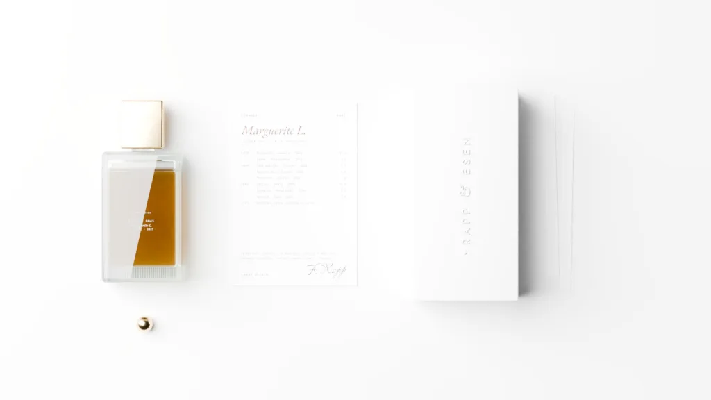
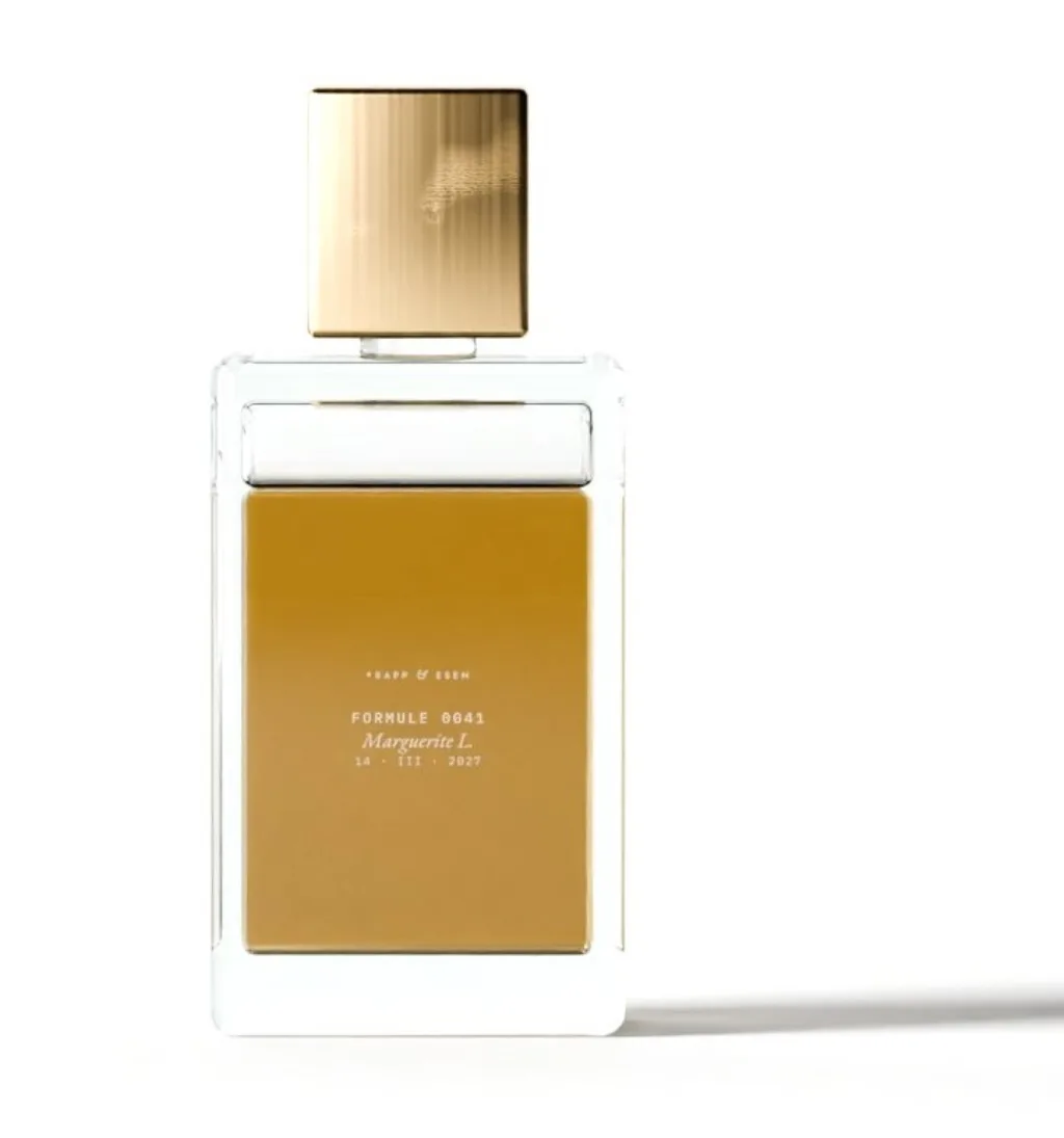
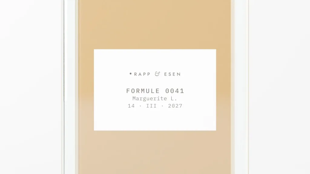
Even the naming holds the position. A formula carries no marketing name. It has a number, a date, and the name of the person it belongs to, engraved in the glass.

The translation
A scent cannot be seen, so every object around it was designed to make the invisible work visible. Six signs carry the house.
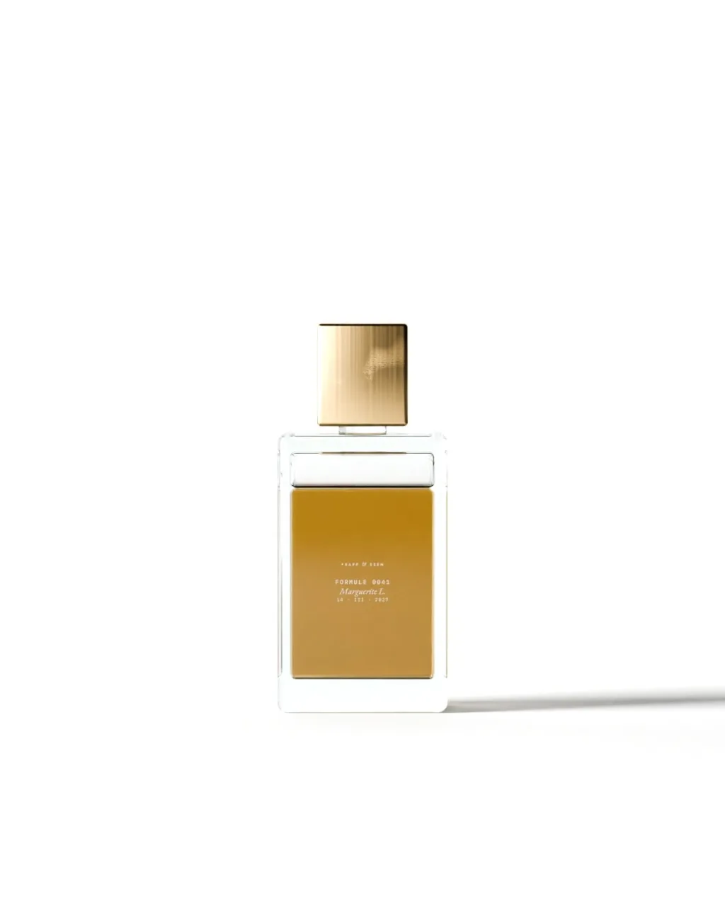
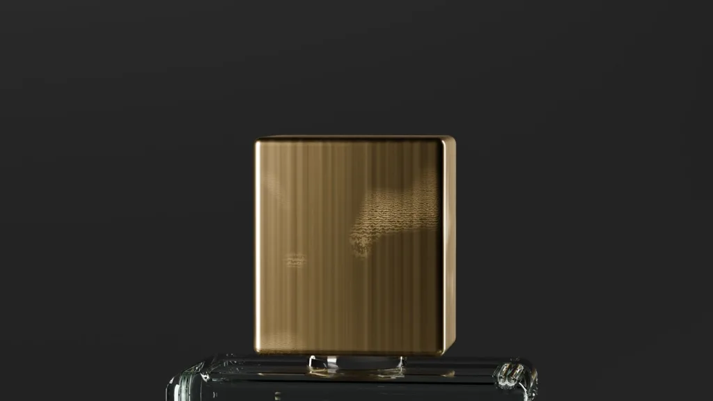
Clear glass, so the liquid shows its own colour. Raw brass, kept with the marks of the hand that made it, not gold. The root, as the emblem. A formula card that writes down about eighty percent of the ingredients and leaves the last twenty with the nose. A recorded voice from Françoise, reached through a single link on the card. And a white box with the name embossed on the lid.
The visual system holds the same restraint: a palette of ink, chalk and ash, a deep green, raw brass and a single ruby accent; a Garamond for the book, a geometric sans for the signs, a monospace for proof, and a handwritten hand wherever the house speaks for itself.

The result
The result is a complete identity and a site that reads like the house itself: the name, the three doors, the process from attunement to refill, the six codes, and a catalogue of one-of-one formulas, each carrying its number, its date and its owner.
Nothing is arbitrary. Every detail has a reason, and the whole holds together, which is exactly what a house built on recognition has to prove before it asks anyone to trust it with their own.
The client’s perspective
Françoise Rapp composed the house from the inside. Her account connects the strategic clarity with the creative execution, from the values beneath the brand to the typography, colours and bottle it became.
From the people involved
“What makes Nizzar exceptional is his rare combination of experience, remarkable sensitivity and creative intuition.”
Brand platform, identity and website for a bespoke perfume house.
Ask me about this work